I’m keen to keep building my ArcGIS skills through internships and throughout my career. I’ve already worked with geospatial data, digital terrain models, and remote sensing, but I’m always looking to improve. Especially in areas like spatial analysis, mapping, and real-world applications for environmental management. I’m excited to gain more hands-on experience, learn from professionals in the field, and apply ArcGIS to practical challenges in conservation, land use, and resource management.
Creation of a Digital Surface Model and Digital Terrain Model from Drone Photography
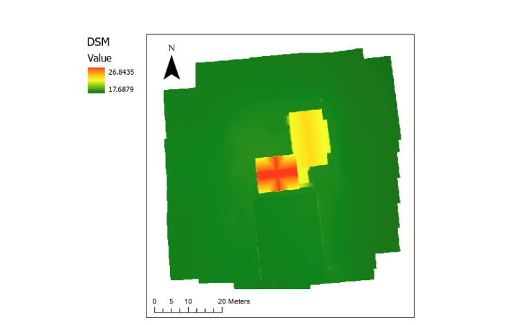
Digital Surface Model (DSM) map with elevation represented by color—green for lower areas and red for higher areas. The map is oriented with north at the top, and the scale in the bottom-left corner indicates 0, 5, 10, and 20-meter increments. This model depicts the football building at Ilam Fields, Ilam, New Zealand. It was created from 28 drone-captured photos, processed into a 3D mesh in Metashape, and georeferenced in ArcGIS.

Digital Terrain Model (DTM) map with elevation represented by color—green for lower areas and red for higher areas. The map is oriented with north at the top, and the scale in the bottom-left corner indicates 0, 5, 10, and 20-meter increments. This model depicts the football building at Ilam Fields, Ilam, New Zealand, created from 28 drone-captured photos. The 3D mesh was processed in Metashape and georeferenced in ArcGIS.
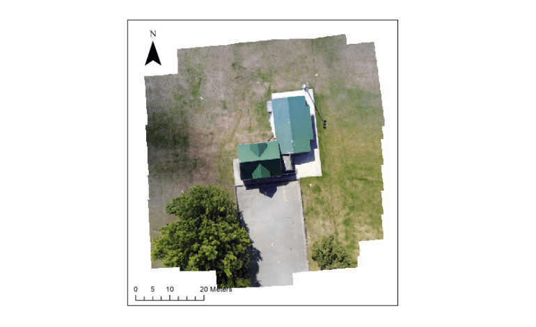
Orthorectified map of the football building at Ilam Fields, Ilam, New Zealand, displayed in true color. The map is oriented with north at the top, and the scale in the bottom-left corner shows 0, 5, 10, and 20-meter increments. This model was created from 28 drone-captured photos, processed into a 3D mesh in Metashape, and integrated into an ArcGIS map for accurate spatial representation.
Dynamic Exposure Analysis to Health-Promoting and Health-Constraining Environments in Christchurch, New Zealand

This map analyzes my dynamic exposure to health-influencing environments in Christchurch using GPS tracking data and the Health Location Index (HLI). The HLI zones (1–10) are classified by color: bright red (1 = highest health constraints) to bright green (10 = highest health-promoting assets), reflecting neighborhood-scale disparities. A 300m buffer around my GPS points (purple circles) intersects these zones, with overlaps categorized as:
- Health-promoting (green) — Greenspaces, supermarkets, recreational facilities.
- Health-constraining (red) — Fast food, alcohol outlets, gaming venues.
- Neither (blue) — Neutral or mixed-use areas.
The analysis quantifies my cumulative exposure time to each category (e.g., 60% promoting, 25% constraining), demonstrating GIS workflows in spatial joins, buffer analysis, and environmental health modeling. Created in ArcGIS Pro for GEOG325, this project underscores the impact of urban design on wellbeing and showcases technical proficiency in geospatial analytics.
